TypeMatch
project overview
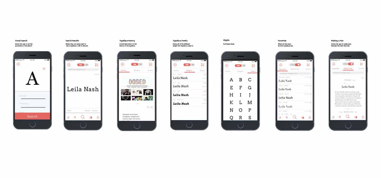
Trying to find the right typography is a lot like trying to find a date. Combing through foundries online can be tedious and overwhelming. Type Match aims to take a simpler and more manageable approach to finding and matching suitable fonts for your projects. Inspired by the dating app Tinder, I created a simple, easy to use app aimed at young designers in their early twenties to mid thirties.
Showcasing the typography is a primary goal of the app. The design aesthetic is minimalistic to allow the typography to shine. A color palette of grey and white were chosen to create a clean look, while a coral tone was introduced for interest and a pop of color and to indicate active buttons. I used the San Francisco typeface family for its clean readability and neutral look.
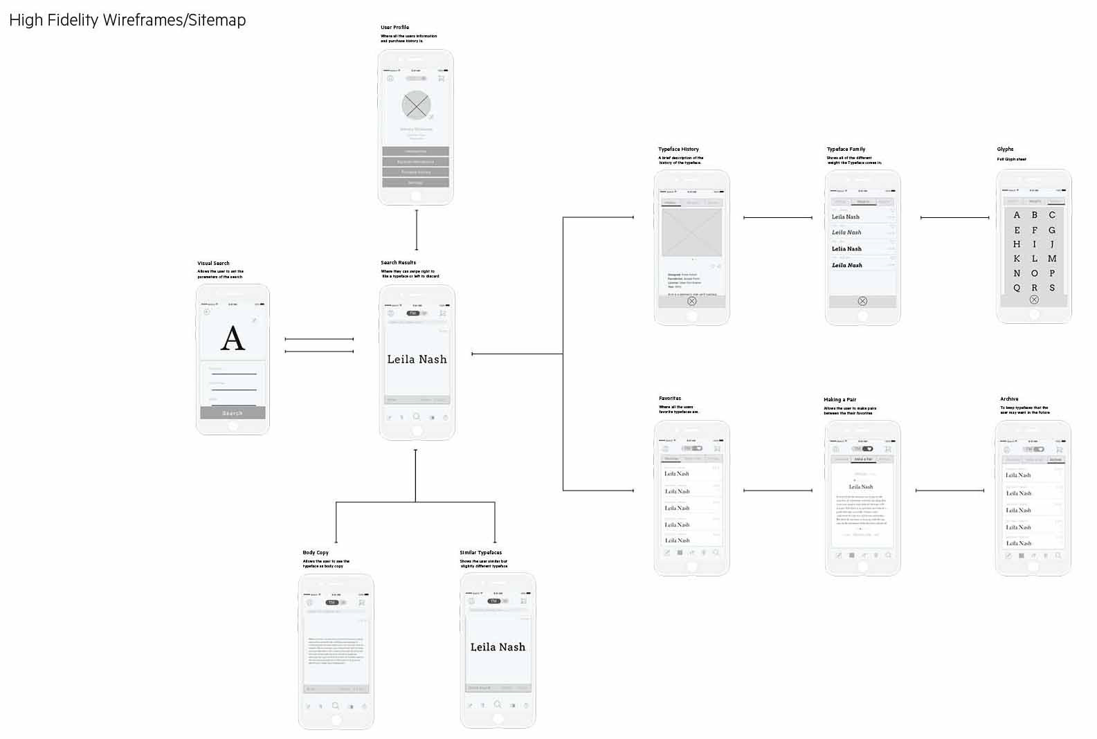
user flow
John's is looking for a thin slab serif for his design homework. He begins by using the sliders on the search screen, allowing him to set font perimeters. After swiping through some candidate fonts, he settles on Avro, a friendly slab with human sensibilities. John clicks on the typeface, which brings him to a detailed information page and allows him to see examples of the font in use. After adding the font to his favorites, he swipes right to pair it with other fonts.