world of concert
Project Overview
Concrete is a complex medium that first became popular in Classical Rome. Despite the utilitarian quality of concrete, our modern world would not be possible without it. World of Concrete is a conference that brings concrete workers of all types together. The target audience is professionals, ages 34-49, skewing heavily male.
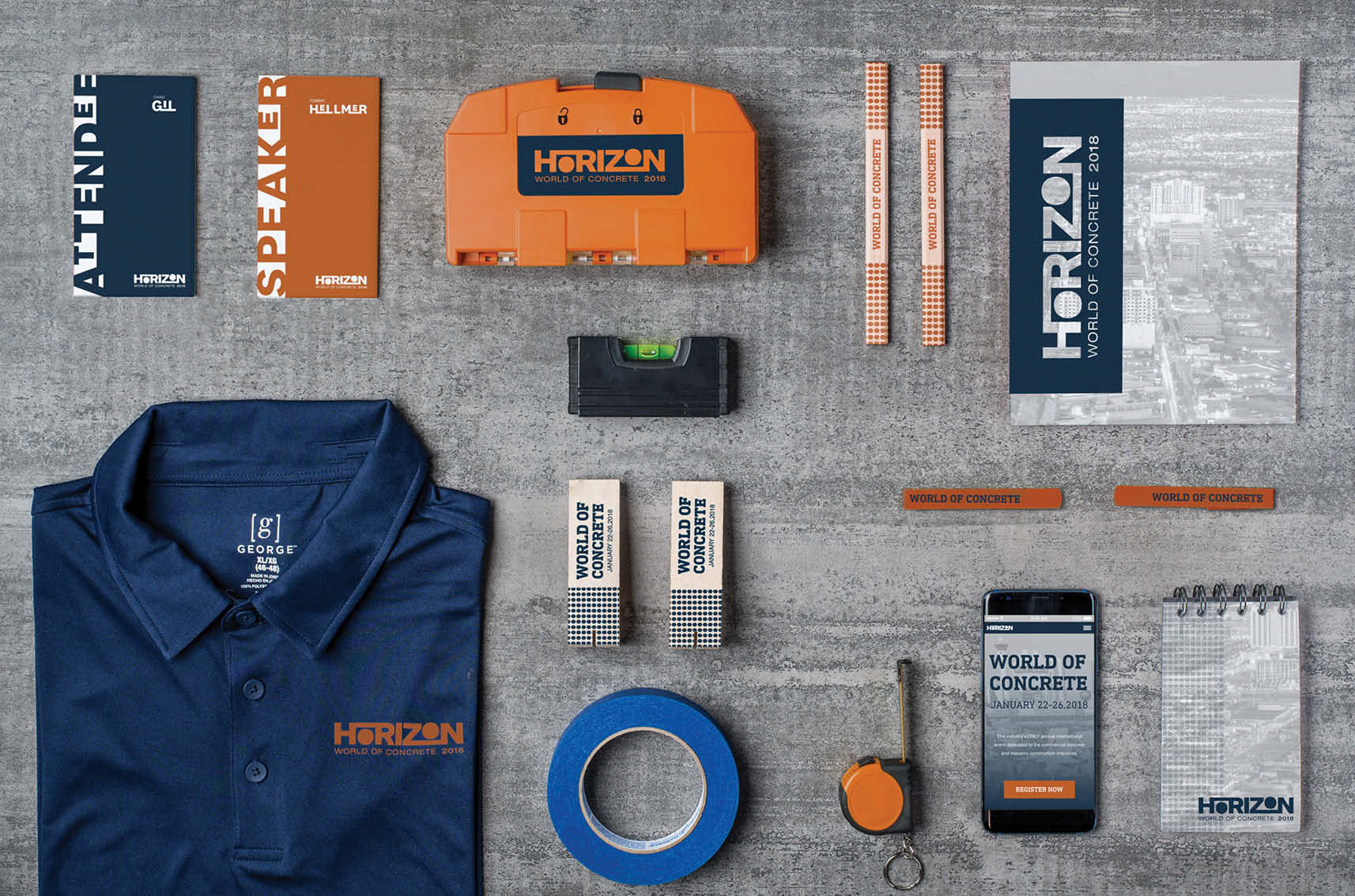
The chosen theme of timelessness plays off the idea that concrete is scattered among horizons all over the world. The Horizon logo incorporates a line treatment that plays on a sun rising above a horizon. I carried the type treatment from the logo over into other typography in the conference branding system. The color palette of orange and blue mimics the colors of the horizon at sunrise. Helvetica was chosen for its clean and structured look that is compatible with the corporate audience.